The Effects of Font Disfluency on Reading Retention
The report from a research study exploring how easier-or-harder-to-read fonts affect what readers remembered.
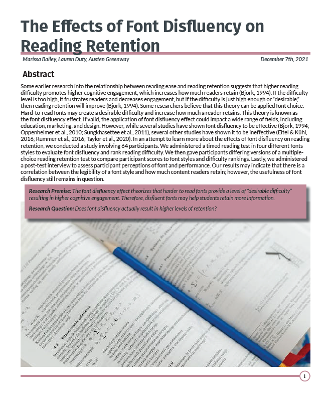
Objective
I originally created this report for a group project for my Research in Technical Communication class. We were tasked with designing and conducting a study on a subject that was relevant to technical communication. After turning in the assignment for class, I went back and made substantial changes to this document both in content and design.
Tasks
• Choose a research topic relevant to the technical communication field.
• Design a study to investigate the chosen topic
• Recruit participants using an approved recruiting method
• Obtain informed consent from participants
• Conduct the study using approved research methods
• Write an IMRaD-style report on the study’s findings
Process
This white paper was originally a group project we created for our technical writing II class, but I wasn’t really happy with the final outcome. I decided that this white paper had great potential, but that I needed to completely start over to create something I would want on my portfolio.
I started by considering what factors drew me to KSU’s technical communication degree. I concluded that it was the versatility of this degree offers. It combines multiple interests I have including writing, design, technology, research, and human thought processes. I had trouble deciding between English, psychology, and computer science for potential degrees. When I learned about technical communication, it solved my dilemma.
After understanding what drew me to the degree, I conducted some informal interviews with other technical communication students to find out why they joined the program. What I discovered was that the majority of them had very similar reasons. Many of them felt “boxed in” when choosing a degree path but technical communication allowed them the freedom to explore many career fields. This realization allowed me to come up with a theme for my white paper: think outside the box.
Going forward into writing, I used what I had learned from my own introspection and interviews with other students to create five sub-themes. These sub-themes became the “5 things” I write about in the white paper. As I wrote the content for each page, I continually returned to the overarching theme and referred back to the research I’d done. I even incorporated some quotes from some of the students (with their consent) who I interviewed.
Design
Because this document represents KSU, I did my best to incorporate KSU’s branded color palette. The main theme colors (black, gold, green, white) are all from KSU’s palette while the sub-theme colors (the oranges, purple, and blues) are colors I chose to coordinate and add distinction to each section.
Even when working on the design of this document, I referred back to my theme. I created box-like elements in gold around the text and then intentionally broke outside of those elements with chaotic lines around images, graphics, callouts, and student quotes. Each page is unconventional but structured, colorful but coordinated, and busy but predictable. The mix of style and structure reflects what we, as students, get out of KSU’s technical communication degree.
Takeaways
This project taught me how important it is to consider real-world context and potential applications when designing a study. The major flaws we found in other research studies all led back to this principle. A study’s design can easily skew the findings of the study, so it’s important to design studies with as much thought, consideration, and research as possible. This also ties in with another takeaway: a research-informed approach is critical to a well-designed study.